The trouble with OS X window management
June 17, 2012
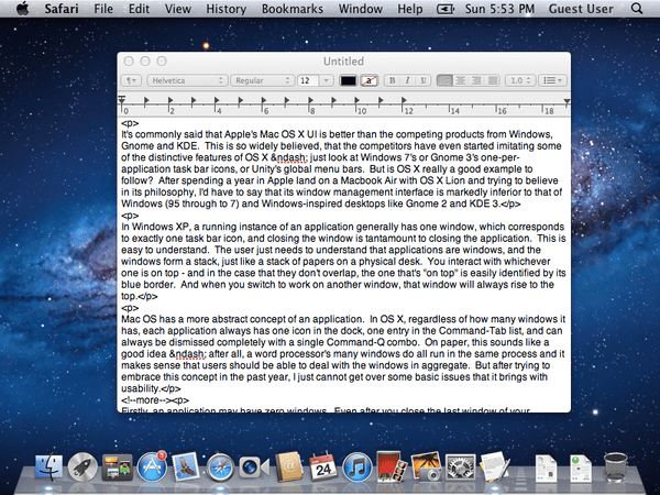
It's commonly said that Apple's Mac OS X UI is better than the competing products from Windows, Gnome and KDE. This is so widely believed, that the competitors have even started imitating some of the distinctive features of OS X – just look at Windows 7's or Gnome 3's one-per-application task bar icons, or Unity's global menu bars. But is OS X really a good example to follow? After spending a year in Apple land on a Macbook Air with OS X Lion and trying to believe in its philosophy, I'd have to say that its window management interface is markedly inferior to that of Windows (95 through to 7) and Windows-inspired desktops like Gnome 2 and KDE 3.
In Windows XP, a running instance of an application generally has one window, which corresponds to exactly one task bar icon, and closing the window is tantamount to closing the application. This is easy to understand. The user just needs to understand that applications are windows, and the windows form a stack, just like a stack of papers on a physical desk. You interact with whichever one is on top - and in the case that they don't overlap, the one that's "on top" is easily identified by its blue border. And when you switch to work on another window, that window will always rise to the top.
Mac OS has a more abstract concept of an application. In OS X, regardless of how many windows it has, each application always has one icon in the dock, one entry in the Command-Tab list, and can always be dismissed completely with a single Command-Q combo. On paper, this sounds like a good idea – after all, a word processor's many windows do all run in the same process and it makes sense that users should be able to deal with the windows in aggregate. But after trying to embrace this concept in the past year, I just cannot get over some basic issues that it brings with usability.
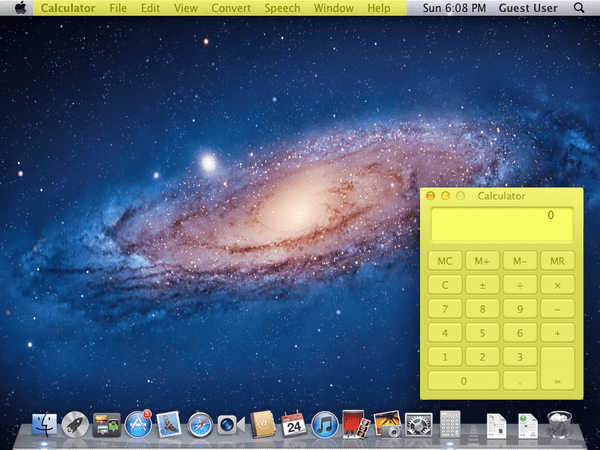
Firstly, an application may have zero windows. Even after you close the last window of your browser, the browser itself is still open. I often find myself switching with Command-Tab to an app with no windows. It's not hard to accidentally do this either because you closed a PDF document that happened to be the last window of the Preview app, or because the app's only windows are not on the current Space (a Space is the equivalent of a Workspace in Gnome or a Desktop in KDE). The only way you can tell you have done so is by looking at the menu bar. In reality, who's going to keep shifting their eyes to the top-left corner of the screen to check what application is focused? I certainly don't, and as a result, I find myself constantly trying to type into the front-most window, even though the focus is still on some invisible application. Actually, there are three other ways to tell that a window is not focused – the text in its title bar is slightly greyed out, the window lacks a shadow, and the Close/Minimize/Zoom buttons are grey, not coloured. But if you're looking at a Google Chrome window (which has no title bar) that takes up the entire screen, only the third cue will help. And as I said earlier, who's going to keep glancing up at the top-left corner? Two simple changes Apple could make to make the situation better would be to give the active window title bar a distinctively different colour, and to highlight the focused application in the Dock. But that doesn't fix the fact it lets you switch to an app with no windows – something you almost never want to do.

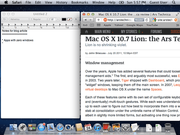
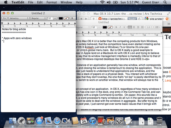
The second problem relates to switching applications with Command-Tab, which is the equivalent of Windows' Alt-Tab. In OS X, Command-Tab will bring the entire application to the foreground. This is often cited as an advantage of the OS X model. In some ways, that's true because it makes the Command-Tab list much shorter than the Alt-Tab list, and it relieves you of having to pick the exact window of the application you select by giving you the window you last used from that app. But it brings deep problems. You see, when you Command-Tab to an app, it brings all of its windows to the foreground. If you're like me, you almost always have your text editor open in the background, with a window for code and a window for notes. You'll be looking at a webpage and see something you want to paste into your notes window, so you Command-Tab to the editor. And bam! Up springs not only your notes, but your windows of code, plastered over your screen and obscuring your browser window. As far as I know, there are a few ways around this, but none are satisfactory. You can either use the mouse to click the window, or you can move the unwanted windows to another Space, or minimise it.
Here's a pop quiz – what key combination do you press to alternate between a Word document and a PDF? And what do you press to alternate between two PDF documents? On Windows, the answer is always the same – Alt-Tab. On OS X, you press Command-Tab for the first one and Command-` for the second one. Unless you have three PDF documents open, in which case you press Command-` to switch from document A to B, and you need to press it twice to go from B to A because document C will get in the way. This is madness. Why should I need to remember whether the window I want to switch to is opened in the current app or not? And why does Command-` keep the windows in an immutable cyclical order while Command-Tab keeps them in most-recently-used order?


Another problem is with the global menu bar. Because applications span multiple (or zero) windows, Apple has put the application menu bar not in any window, but at the top of the screen. Logical? Far from it. The theory is that the menu bar will hold actions that transcend windows (for example, Safari has New Window and Quit), but on the contrary, most of the menu items I see act on the currently selected window (see New Tab, Cut/Copy/Paste, Reload This Page). And even if the menu bar was restricted to application-level actions, it doesn't even make sense to put an application-level menu bar in the same row as system-level widgets like the system menu, the Spotlight icon, the clock, and the "system tray" (whatever its real name is). To further discredit the global menu bar, toolbars – which are theoretically shortcuts to menu items – live inside individual windows. In reality, the only acceptable reason for putting the application menu bar where it is, is to save space.

Admittedly, there is another good thing about a menu bar at the edge of the screen – Fitt's Law. Fitt's Law has a few consequences, but one is that it's easier to click on things that sit on the edge of the screen. With the menu bar at the top edge, it is easy to slam the mouse up against the edge to click on it. But while edges are nice, corners are even nicer, and OS X fails to take advantage of them. Generally, the only two corners with widgets are the top left for the system menu and the top right for Spotlight. And I'd say that the system menu is not something you'd want to click on all the time. For comparison, a Windows 7 desktop with a maximised window will give you easy access to the Close button in the top-right, the Start button in the bottom-left, and the Show Desktop button in the bottom-right.

Speaking of maximised windows, that's something that OS X seems to discourage. If you want a window to take up as much space as possible, there's no button for that; you'll have to drag it out yourself. There's the green "Zoom" button, which supposedly resizes the window to the "optimal" size, but its behaviour is so unpredictable that I don't know of anyone who uses it. Some might say that you're wasting screen real estate if you get into a habit of always maximising your windows, but OS X gives you no help with organising your windows in any way whatsoever. There's no Aero Snap or any form of an intelligent layout algorithm; heck, until last year, you weren't even allowed to resize the window from any edge other than the bottom-right corner.
Finally, there's no task bar. There's no always-visible list of windows in the current Space; you get no sense of the windows in the current space. The Dock is virtually useless because the dot next to the app icon tells you nothing - sure, it tells you the app is open, but could have one, two, fifteen, or zero windows. You are forced to constantly enter Exposé to maintain your sense of what you have open. And because entering Exposé is harder than glancing at a task bar, the result is that you end up gathering craploads of stale windows hanging around longer than they should.
Given the multitude of problems I have identified above, it baffles me that Windows, Gnome and Ubuntu's Unity all seem to be copying many of these ideas. Even worse, they are shoehorning them into a place where they certainly don't belong: the one-window-per-app model. For instance, Ubuntu Unity inexplicably removes the menu bar from the window and puts it in the system wide bar at the top of the screen. There's just no reason to do so when Linux developers design their GUIs with the assumption that it will appear inside the window. Unity even goes one worse than Apple's version by hiding the menu bar until the mouse pointer moves over the title bar.
My message to anyone who's responsible for any of the aforementioned window managers is this: just because it comes from Apple doesn't make it a good idea, and it certainly doesn't make it a good idea to copy it.